California is no stranger to dry weather and strict water regulations. Yet despite these restrictive measures, getting a clear picture of whats happening often means sifting through dense academic papers or navigating clunky government portals. Adding to this challenge is the know how required to work with the data.
Motivated by this need for accessible view of California’s water and where it comes from, my project aims to take a look at a few water usage trends across the state. Using publicly available data from the California Water Data Consortium my goal is to help answer the following questions:
1. How have statewide water shortages evolved over recent years, and how severe have they been? (Target Audience: California State Policy Makers) from: actual_water_shortage_level
I am using actual_water_shortage_level.csv which tracks water shortages in California. The dataset includes reports from public water systems with assigned shortage levels.
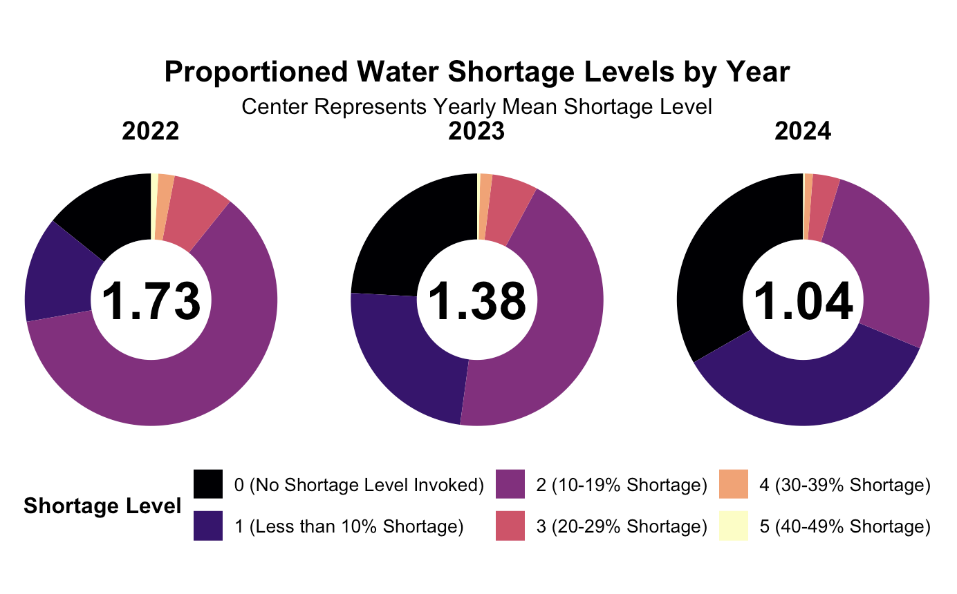
I used start_date to determine the year and grouped the data by state_standard_shortage_level which organizes shortages from 0 (no shortage) to 6 (severe shortage). I calculated the total number of reported shortages per level each year and converted them into percentages for easier comparison. The donut chart shows how shortages are distributed over time, with the yearly average shortage level displayed in the center.
Variables used:
start_date – Extracted to track shortages by year.
state_standard_shortage_level – Represents the shortage level category.
Calculated Variables:
total_shortage – Counts occurrences of each shortage level.
percentage – Normalized shortage levels per year.
mean_shortage – Yearly average shortage level.
Here we can see a visualization of the 2022-2024 and a spread of call the counties by their reported shortage level indicator for that year. In the middle of our graph we can see the overall average shortage indicator for that year. From this we can see that the shortage value on average is steadily decreasing over time dropping from 1.73 in 2022 to 1.04 in 2024. Thats overall good news as it means that on average most of the counties in california fall around ~10% shortage. Unfortunately our dataset was limited to only years 2022-24 hence the selected range.
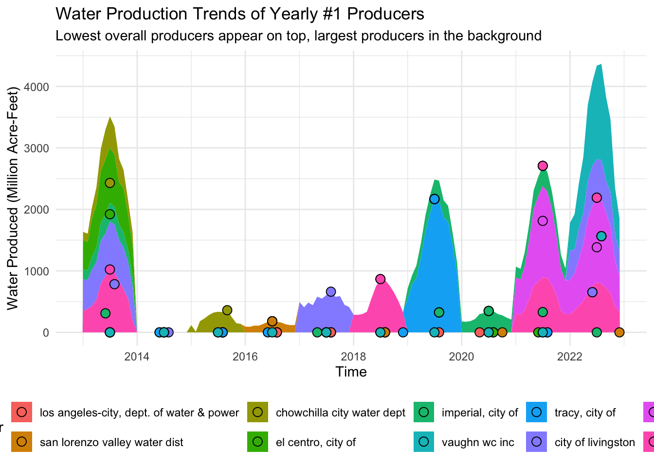
2. Which water system produces the most water each year and how do they change over time? Are they still the highest producers? (Target Audience: Environmental Researchers) from: historical_production_delivery
I used historical_production_delivery.csv which records water production and delivery for public water systems.
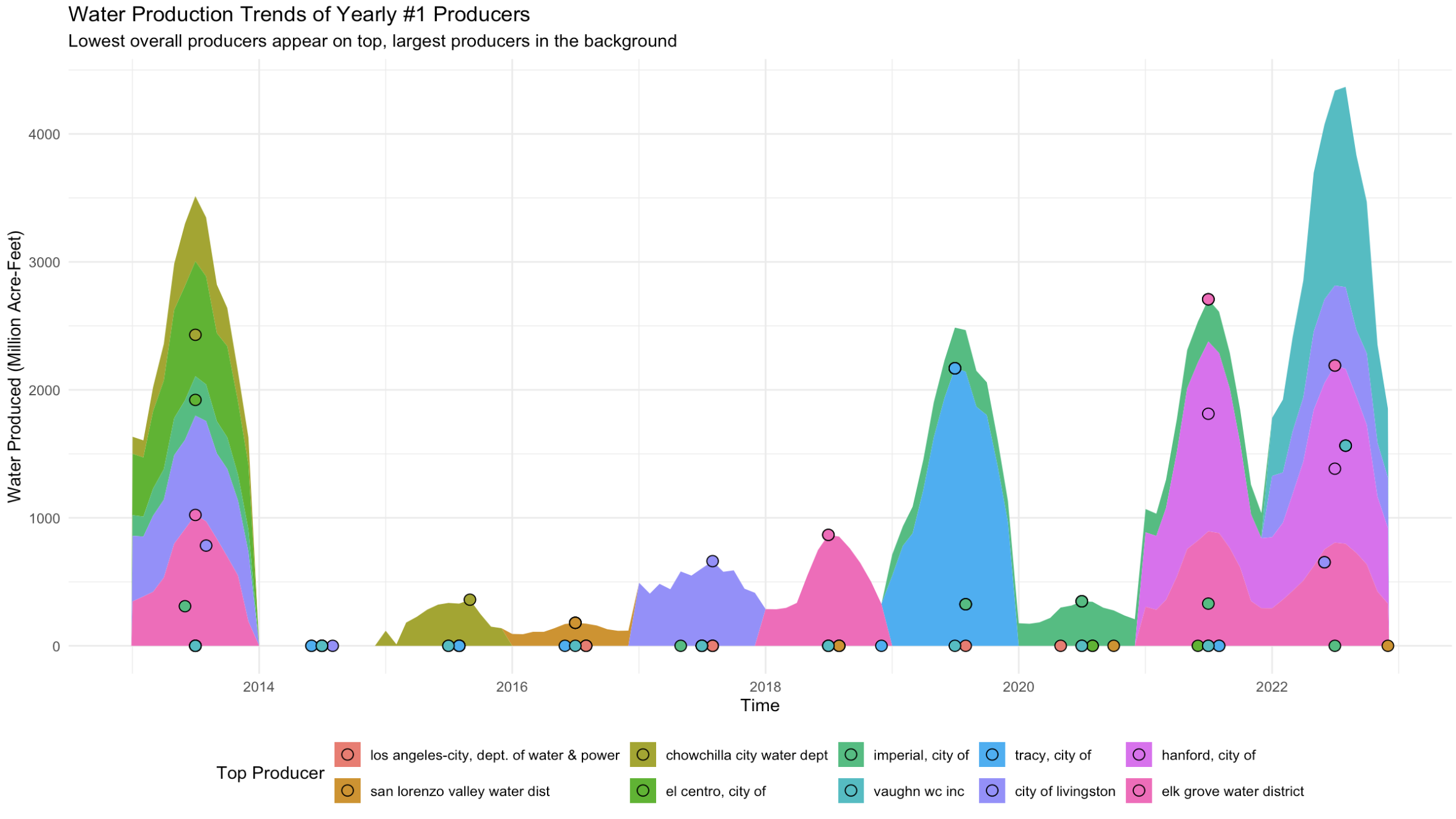
To find the top producers I filtered for water_produced_or_delivered == "water produced" and grouped the data by water_system_name and start_date. I then summed quantity_acre_feet per year to determine the top producer annually. I pulled the full production history of each top producer and plotted their trends over time.
The area chart compares these top producers layering them so the largest producer appears in the background while smaller producers overlay on top.
Variables used:
start_date – Extracted to track production by year.
water_system_name – Identifies the producing water system.
water_produced_or_delivered – Filters for "water produced".
quantity_acre_feet – Total amount of water produced.
Calculated Variables:
total_produced – Sum of quantity_acre_feet per system each year.
total_produced_m – Converted to millions for easier visualization.
For this plot I wanted to see the number 1 producer (total annual) of each year and how they compare with each other or if they are still the number one producer across other years. I also added points for the top produced month of each supplier for each year as reference as some were too low to be noticed while others were easily distinguishable. Our data is compacted to a factor of millions so the really low productions years are not as noticeable as seen in 2014 and a few years after but thats not the point of this graph. We want to see the peaks and whos producing them. Interesting thing to note is that not one producer kept the crown of top producer for more than one year. Also to note there were a plethora of other suppliers but for the sake of narrowing the scope to get a general picture of our producers it was necessary to focus on top producers.
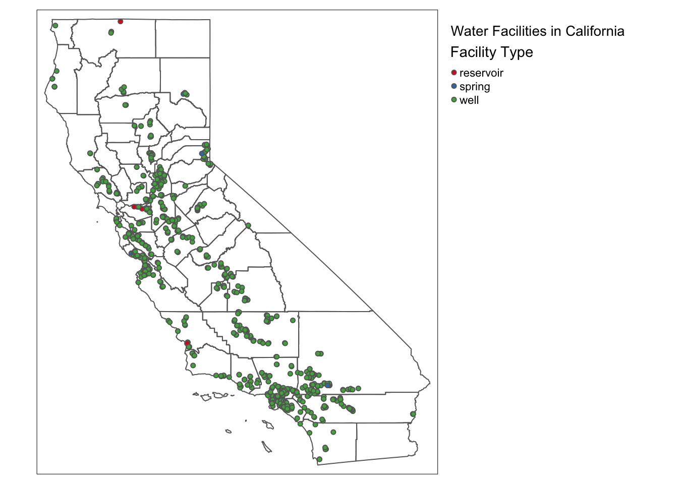
3. What types of water facilities exist in my City (in California)? (Target Audience: Local Government & Water Management Agencies) from: source_name
I used source_name.csv and California_Drinking_Water_System_Area_Boundaries.shp to map water facility types across California.
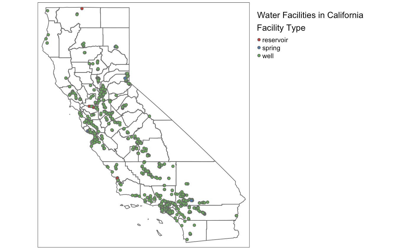
The dataset includes source_facility_type which classifies each facility as a well, spring, reservoir, or other type. The dataset also provides latitude and longitude, which I used to plot facilities on a static map.
To focus on key facility types I filtered for "well", "spring", and "reservoir". I overlaid these on CA_polygon which provides city boundaries. This map shows the locations of different facility types within cities.
Variables used:
source_facility_type – Categorizes facilities.
latitude, longitude – Used to plot facility locations.
Boundary Variables:
CA_polygon – Provides city boundary overlays.
For this chart I simply wanted to share where these water sources are and what they are. This is a simplified version focusing on our key facility types, but it still shows you the sheer volume of wells and how a large chunk of California relies on such a key piece of infrastructure. Other facility types were not relevant to our data process as they were either too niche or commercial features that would not be able to be grouped with our sources. We can see a few reservoirs and almost no springs which makes sense given the efficacy of wells and the fact that there are geographically a much smaller in comparison (generally speaking).
Below is the full code for your to go through an recreate the visualizations we have discussed in this analysis.
── Attaching core tidyverse packages ──────────────────────── tidyverse 2.0.0 ──
✔ dplyr     1.1.4     ✔ readr     2.1.4
✔ forcats   1.0.0     ✔ stringr   1.5.0
✔ ggplot2   3.5.1     ✔ tibble    3.2.1
✔ lubridate 1.9.3     ✔ tidyr     1.3.1
✔ purrr     1.0.2
── Conflicts ────────────────────────────────────────── tidyverse_conflicts() ──
✖ dplyr::filter() masks stats::filter()
✖ dplyr::lag()    masks stats::lag()
ℹ Use the conflicted package (<http://conflicted.r-lib.org/>) to force all conflicts to become errors
library(ggplot2)library(here)
here() starts at /Users/takeenshamloo/MEDS 2024-25/MyWebsite/takeenshamloo.github.io
library(dplyr)library(lubridate)library(viridis)
Loading required package: viridisLite
library(janitor)
Attaching package: 'janitor'

The following objects are masked from 'package:stats':

    chisq.test, fisher.test
library(spnaf)library(sf)
Linking to GEOS 3.11.0, GDAL 3.5.3, PROJ 9.1.0; sf_use_s2() is TRUE
library(tmap)
Breaking News: tmap 3.x is retiring. Please test v4, e.g. with
remotes::install_github('r-tmap/tmap')
# Load actual shortage data.actual_shortage_data <-read_csv(here("data", "actual_water_shortage_level.csv"))
Rows: 12313 Columns: 6
── Column specification ────────────────────────────────────────────────────────
Delimiter: ","
chr  (2): pwsid, supplier_name
dbl  (2): org_id, state_standard_shortage_level
date (2): start_date, end_date

ℹ Use `spec()` to retrieve the full column specification for this data.
ℹ Specify the column types or set `show_col_types = FALSE` to quiet this message.
# Convert start_date to year format.actual_shortage_data <- actual_shortage_data %>%mutate(year =year(as.Date(start_date)))# Remove NA shortage levels.actual_shortage_data <- actual_shortage_data %>%filter(!is.na(state_standard_shortage_level))# Summarize data to get total shortage per level per year.shortage_summary <- actual_shortage_data %>%group_by(year, state_standard_shortage_level) %>%summarise(total_shortage =n(), .groups ="drop")# Scale shortages to percentages so each year sums to 100%.shortage_summary <- shortage_summary %>%group_by(year) %>%mutate(percentage = (total_shortage /sum(total_shortage)) *100) # Convert to % per year# Compute average shortage level per year.average_shortage <- actual_shortage_data %>%group_by(year) %>%summarise(mean_shortage =round(mean(state_standard_shortage_level, na.rm =TRUE), 2))# Add details for legend for readability.levels <-c("0"="0 (No Shortage Level Invoked)","1"="1 (Less than 10% Shortage)", "2"="2 (10-19% Shortage)", "3"="3 (20-29% Shortage)", "4"="4 (30-39% Shortage)", "5"="5 (40-49% Shortage)", "6"="6 (Greater than 50% Shortage)")# to flip colors in scale_fill(direction = -1)# Create the donut chart.ggplot(shortage_summary, aes(x ="", y = percentage, fill =factor(state_standard_shortage_level))) +geom_bar(stat ="identity", width =1) +# White border for separation.coord_polar(theta ="y", start =0) +# Convert to donut chart.facet_wrap(~ year, ncol =3) +# Separate donuts for each year.scale_fill_viridis(discrete =TRUE, option ="magma", labels = levels) +# Use viridis magma scaletheme_void() +theme(legend.position ="bottom",legend.title =element_text(size =12, face ="bold"),legend.text =element_text(size =10),strip.text =element_text(size =14, face ="bold"),plot.title =element_text(size =16, face ="bold", hjust =0.5),plot.subtitle =element_text(size =12, hjust =0.5) ) +labs(title ="Proportioned Water Shortage Levels by Year",subtitle ="Center Represents Yearly Mean Shortage Level",fill ="Shortage Level" ) +# Add the white circle in the middle to create the donut hole.annotate("point", x =0, y =0, size =30, color ="white") +# Add mean shortage level text in the center of each donut.geom_text(data = average_shortage, aes(x =0, y =0, label = mean_shortage), color ="black", size =10, fontface ="bold", inherit.aes =FALSE)
Rows: 902112 Columns: 8
── Column specification ────────────────────────────────────────────────────────
Delimiter: ","
chr  (4): pwsid, water_system_name, water_produced_or_delivered, water_type
dbl  (2): org_id, quantity_acre_feet
date (2): start_date, end_date

ℹ Use `spec()` to retrieve the full column specification for this data.
ℹ Specify the column types or set `show_col_types = FALSE` to quiet this message.
# Get year from start_date.historical_df <- historical_df %>%mutate(year =year(as.Date(start_date)))# Identify the #1 producer for each year.top_producer_per_year <- historical_df %>%filter(water_produced_or_delivered =="water produced") %>%# Filter only production.group_by(year, water_system_name) %>%summarise(total_produced =sum(quantity_acre_feet, na.rm =TRUE), .groups ="drop") %>%# Sum per year.arrange(year, desc(total_produced)) %>%# Sort within each year.group_by(year) %>%slice_head(n =1) # Select the #1 producer for each year.# Get full time series for these top producers.top_producer_trends <- historical_df %>%filter(water_produced_or_delivered =="water produced") %>%# Only produced watersemi_join(top_producer_per_year, by ="water_system_name") %>%# Keep only top producersgroup_by(year, start_date, water_system_name) %>%summarise(total_produced =sum(quantity_acre_feet, na.rm =TRUE), .groups ="drop") %>%mutate(total_produced_m = total_produced /1e6) # Convert to millions# Sort water systems by total production so the largest is plotted last. # Might change later...total_produced_order <- top_producer_trends %>%group_by(water_system_name) %>%summarise(total_produced =sum(total_produced_m, na.rm =TRUE)) %>%arrange(total_produced) %>%# Smallest producer first, largest last. (might change)pull(water_system_name)# To figure out which were the top months by for our suppliers that year.# Originally wanted to do top monthly producer plotted with a top yearly# producer icon, but was having trouble imagining the calculations and how to# get it to plot onto geom_area with our top_producer_trends.# to fix if resubmitting. top_producer_month_points <- top_producer_trends %>%left_join( top_producer_per_year %>%select(year, water_system_name),by =c("year", "water_system_name") ) %>%filter(!is.na(total_produced)) %>%group_by(year, water_system_name) %>%filter(total_produced ==max(total_produced)) %>%slice(1) %>%ungroup()# Convert to factor with proper order.top_producer_trends$water_system_name <-factor(top_producer_trends$water_system_name, levels = total_produced_order)# Plot area chart with layered fills.ggplot(top_producer_trends, aes(x =as.Date(start_date), y = total_produced_m, fill = water_system_name)) +geom_area() +# Transparent fills, no stacking# Add a special symbol for each top producer's peak monthgeom_point(data = top_producer_month_points,aes(x =as.Date(start_date), y = total_produced_m),position =position_stack(),shape =21, # or 22, 23, etc. 21 is a nice circle with fillsize =3,color ="black", # outline color ) +labs(title ="Water Production Trends of Yearly #1 Producers",subtitle ="Lowest overall producers appear on top, largest producers in the background",x ="Time",y ="Water Produced (Million Acre-Feet)",fill ="Top Producer",color ="Top Producer" ) +theme_minimal() +theme(legend.position ="bottom")
Rows: 10650 Columns: 10
── Column specification ────────────────────────────────────────────────────────
Delimiter: ","
chr (7): pwsid, source_facility_id, source_facility_name, source_facility_ac...
dbl (3): org_id, latitude, longitude

ℹ Use `spec()` to retrieve the full column specification for this data.
ℹ Specify the column types or set `show_col_types = FALSE` to quiet this message.
Coordinate Reference System:
  User input: NAD83
  wkt:
GEOGCRS["NAD83",
    DATUM["North American Datum 1983",
        ELLIPSOID["GRS 1980",6378137,298.257222101,
            LENGTHUNIT["metre",1]]],
    PRIMEM["Greenwich",0,
        ANGLEUNIT["degree",0.0174532925199433]],
    CS[ellipsoidal,2],
        AXIS["latitude",north,
            ORDER[1],
            ANGLEUNIT["degree",0.0174532925199433]],
        AXIS["longitude",east,
            ORDER[2],
            ANGLEUNIT["degree",0.0174532925199433]],
    ID["EPSG",4269]]
# Select facility types of interest.selected_facility_types <-c("well", "spring", "reservoir") # Limit filter for now.filtered_source_geo <- source_geo %>%filter(source_facility_type %in% selected_facility_types)tmap_mode("plot")
tmap mode set to plotting
# Build base map.base_map <-tm_shape(CA_polygon) +tm_borders()# If no data, plot only the base map.if (nrow(filtered_source_geo) ==0) {print(base_map)} else { base_map +tm_shape(filtered_source_geo) +tm_symbols(col ="source_facility_type", # Color points by facility type.palette ="Set1", size =0.1,title.col ="Facility Type" ) +tm_layout(title ="Water Facilities in California",title.position =c("left", "top"),legend.outside =TRUE, # Move legend outside the plot.legend.outside.position ="right", # Place legend on the right side.legend.frame =FALSE# Remove legend border for cleaner look. )}